Your Website Needs Color and Contrast

NOTE – I found this old blog post in my drafts, so I did some time editing it, link checking, etc., and hit publish of an old draft.

To Read Your Content

To allow people to read your content, you need to make sure to have the color contrast as high as possible. So people can read what you have written. It shouldn’t be so high that it bothers people with low vision. Were too much contrast makes it difficult for them to read.

Putting light text on pastel or light backgrounds is not good for some people. You also have to think about the different types of color deficiencies (colorblindness). Meaning you don’t want to have red text on a green background, etc.

A Useful Tool

Below are a few different tools I use to check color contrast. The color contrast tool I use the most is Jonathan Snook’s web-based “Colour Contrast Tool”.  It’s the tool I use to check color contrast for the development team at work or if I have chosen will work.

W3C Recommendation for Color Contrast

Here’s the W3C recommended values from the WCAG 2.0 – 1.4.3 Contrast (Minimum) Level AA.

Following these guidelines ensures that foreground and background color combinations provide enough contrast. This pertains to those with color deficiencies. To pass your text and background need to have a color contrast ratio of at least 4.5:1 or higher to pass.

How High Should Your Color Contrast Be

You also have to think about how the web page or application is going to be used. Now, if it a heat index application that is likely going to be used outdoors. You have to consider most high heat index days will probably be in bright sunlight. So blaring sunny will not work well with a contrast ratio that passes b a little bit.

Color Deficiency or Colorblindness

Another tool is the “Color Oracle.” It’s used to simulate different types of colorblindness. They have Windows, Mac, and Linux versions created by Bernhard Jenny, Oregon State University (programming), Nathaniel Vaughn Kelso, and Stamen Design, San Francisco (ideas, testing, and icon).  The application places a color overlay for your entire main screen. You can set up different PF or function keys to turn on and off different types of colorblindness masks easily.

Doing this allows you to check against the three main types of color blindness. About 10% of the population is colorblind. Most of them are males. The three main types of color blindness are:

  • Deuteranopia or deuteranomaly (a form of red/green color deficit) – 7.5% of all males.
  • Protanopia or protanomaly (another form of red/green color deficit) – 2.5% of all males.
  • Tritanopia (a blue/yellow deficit- very rare) – Less than 0.3% of women and men.

More Tools

Next is the full list of tools I would you for building websites. Your choice will depend on how you work and what’s best for you.

I hope these tools are helpful to you in checking for color contrast issues.

Additional Reading

For a more detailed look at color contrast, you need to read Todd Libby’s color contrast article called “Contrasting Accessibility with Color Contrast“. You should also follow him on Twitter at @ToddLibby.

Any Recommendations

If you have any other tools that you use and think I should checkout, please leave a comment, and I will give them a look.

Playing Around with Flexbox by Starting with Articles and CodePen’s from Others

About a week ago on January 13, 2019, I saw a tweet from Heydon Pickering  ( @heydonworks ) talking about how he was using Flexbox to switch directly between multiple and single column layouts but didn’t have time to read it at the time because I was at work.

Later that day I saw Jonathan Snook ( @snookca ) had tweeted about some tweaks he had made to Heydon’s CodePen example.

Here is Heydon’s “The Flexbox Holy Albatross” article which he didn’t want to use media queries or JavaScript, along with Jonathan’s article about Heydon’s “Understanding the Albatross” article. NOTE: I used media queries to change font sizes in my example.

Started to Play with Heydon’s Code

After reading through both articles, I started playing around with Heydon’s CodePen to see what would happen with only two blocks for my jfciii Ate Here restaurant list. After playing around for a bit, I grabbed the HTML and CSS I had messed with and copied it into Textmate to make one page using my template for jfciii Ate Here. At that point, I gathered a few restaurants from my list of place to eat in Washington, DC and replaced the blocks with real content to see what doing so would be like on the page.

Part of my picking certain restaurants was to gather ones with different lengths to content for the same row for a wide width screen (think desktop/laptop). At first, I started with two per restaurants to see what that looked like for desktop/laptop and different width between there and a narrow width for a phone.

To me, it seemed that having two items to a line/row seemed like it could be confusing when reading the content, But then I remembered that most of the time people would most likely checking for restaurants on their phones while they were out wandering a city or sitting with friends instead of a desktop or laptop.

Pushed My Code Example

After pushing the updates a few different times to my website, I asked a coworker what they thought about the two columns, and they thought maybe adding a bit of space between the two columns would make it easier to read.

I then spent some time working on my CSS to add a few REMs worth to the right of them which seemed to work. But then I had the problem of forgetting I had to only added it to the first item in the list for a widescreen device. I ended up using :nth-child(odd), so the extra padding was on the first item in the row. Next, I had to remove the extra padding when in a narrower view such as on my phone.

Then I decided to attempt to use three restaurants to a row for a few rows and then two for one, and one with only one restaurant to see how they all looked before updating my PHP code to generate a given amount to my application page.

When I did that, I then had to add a max-width to the restaurant content container, so it didn’t span the width of a row, so the reading experience was better for people because of the long line length.

So here is my experiment with a bit of flexbox for jfciii Ate Here and the current look of one restaurant at a time for the wider width.

Thanks, Guys

Thanks, again Heydon and Jonathan for your articles and examples to get me to play around with flexbox.

Further Reading and Video Watching

Now it’s off to spend time finishing up reading Rachel Andrew’s ( @rachelandrew ) book from A Book ApartThe New CSS Layout“. Then start reading Rachel and Jen Simmons ( @jensimmons ) other work and watching both of their amazing videos to understand CSS Grid better. See below for more of their work.

Rachel Andrew

Jen Simmons

Conclusion

Please leave a comment of which number of restaurants per row for wider screens you think works for ease of reading and compare against my current version of jfciii Ate Here.

Mobile Articles, Blog Posts, Resources, etc. from Work and Home Computer Bookmarks

Two people over a week ago asked me for mobile resources one for checking accessibility on mobile devices and the other for general information, so I figured I would publish them for all to see. Here are a bunch of resources from my work bookmarks, along with even more from my home laptop. A bunch of these articles, blog post, etc. are five or six years old, but the ideas and concepts are still worth reading.

UPDATED broken and redirected links – 01/02/2017.

The information is grouped together by the organization or person that wrote them.

BBC Mobile

Henny Swan

Paul Adam – this mobile resources page has a lot of links on it

Marcy Sutton

Luke Wroblewski

Apple – iOS

Videos

Android

Brad Frost

Jason Grigsby

Brian Fling

SSB Bart Group

Rachel Andrew

PPK

jQuery

Miscellaneous Mobile Accessibility

Hopefully, some or all these were helpful to you.

Simple Accessibility Updates to Improve New York Times New Redesign – Part 2

For those following along, this is Part 2 of my series on how the New York Times can make simple updates to improve their website’s accessibility. “Part 1 – Simple Accessibility Updates to Improve New York Times New Redesign” is available for those who missed reading it.

Reminder: I’ve written these posts to help to the New York Times, along with anyone with large websites, or those who are designers or developers, etc., to show that simple incremental changes can improve their website in the long run.

In this post, I will cover the following accessibility issues with the New York Times home page:

  • Missing skip navigation
  • Difficultly seeing visual cues for those only using the keyboard
  • Poor color contrast
  • Not able to use video player by keyboard only
  • No captioned videos for individuals that are deaf or hard-of-hearing

Adding Skip Navigation

Skip navigation allows people that use a keyboard or assistive technologies like screens reader JAWS, NVDA, VoiceOver, etc.) to bypass large sets of links and focus on the content. Unfortunately, the New York Times pages are missing skip navigation, which means that screen reader users must listen to all of the preceding content before getting to the main articles.

Adding skip navigation to your pages is fairly easy as shown in this article on my blog called “Are You Using Skip Navigation?”.

You can choose between a few different techniques to hide your skip navigation depending on what your design team or marketing department want. Here are a few articles about skip navigation:

Note: These websites have additional accessibility articles you might want to read when you have the time.

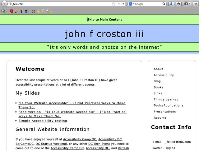
An example of skip navigation can be found on my main website (press TAB to see the “Skip to Main Content” link at the top of the page). I haven’t yet updated my blog’s WordPress theme to include skip navigation.

Visible 'Skip to Main Content' link on jfciii.com website

Thinking About Color Deficiency (Colorblindness)

Approximately 8% of the population (mostly male) has one of the three main types of colorblindness (deuteranopia, protanopia, and tritanopia). This, along with small text, might make it difficult to read parts of the New York Times homepage.

The following examples demonstrate what people with normal vision see as compared to the three main types of colorblindness:

The opinion page section with now colorblindness mask added

Normal vision

Deuteranope colorblindness mask added to the opinion page section

Deuteranope (a form of red/green color deficit)

Protanope colorblindness mask added to the opinion page section

Protanope (another form of red/green color deficit)

Tritanope colorblindness mask added to the opinion page section

Tritanope (a blue/yellow deficit- very rare)

To help people who are colorblind, the New York Times needs to verify the color contrast ratios.

Analyzing Color Contrast

For those who have low vision, poor eyesight, or colorblindness, some of the text on the New York Times home page could be difficult to read. An example would be the bylines to their articles.

New York Times feature article bylines

Bylines from New York Times feature articles on home page

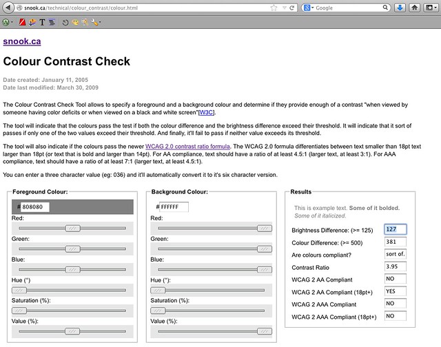
If you were to use one of the many check color contrast tools, such as Jonathan Snook’s “Colour Contrast Checker” you input the foreground (font/text) color and the background color to see if it passes WCAG 2.0 standards:

  • Level AA: contrast ratio of 4.5:1 for normal text and 3:1 for large text
  • Level AAA: contrast ratio of 7:1 for normal text and 4.5:1 for large text

You can be get the hexadecimal numbers from Photoshop (designers), or by right clicking the text and having the Firefox plug-in FireBug (developers). In this case the CSS is:

.NYT5Style .byline { color: #808080; font-size: 10px; line-height: 12px; margin: 4px 0 2px; }

The screenshot shows the Colour Contrast Checker after I added the CSS from one of the home page bylines. As you can see, the foreground color #808080 is a light gray, which has inadequate color contrast on a white background with a ratio of 3.95.

New York Times poor byline color contrast show on Jonathan Snooks colour contrast tool
Another reason it might be difficult for others to read the byline is because the font size is only ten pixels (10px). I recommend that the font size be no smaller than 12 to 14 pixels (12px to 14px) depending on font choice. The font Arial at 12 pixels (12px) is smaller than Helvetica at 12 pixels (12px).

Some of the more popular color contrast checkers/resources are:

Providing Visual Cues for Keyboard-only Users

It is difficult to see where you are (that is, which links are active) when tabbing through the home page. One way the New York Times can fix this is by adding “:active” (IE browsers) and “:focus” (for all other browsers) in the CSS to the elements that include “:hover.” Then, when you tab, the links are indicated (in this example, with an underline).

Here are the current and updated examples of the CSS:

Current CSS

a:hover { text-decoration: underline }

Updated CSS

a:hover, a:focus, a:active { text-decoration: underline }

Making the Video Player Keyboard Accessible

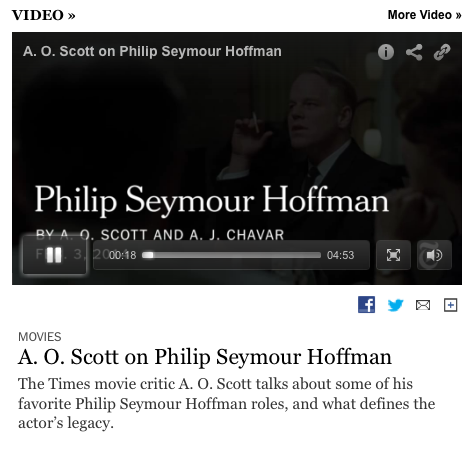
Keyboard-only users cannot play, pause, enlarge the video to fill the entire screen, or change the volume.

A friend who works in the accessibility field asked if I knew of any way to make a YouTube player keyboard accessible for a .gov website he and his team were working on. I told him how Derek Featherstone and his team had used YouTube’s API to create their own links to play, pause, etc. the video by using JavaScript and CSS to place the links over the inaccessible ones. Due to time constraints, my friend and his teammates added an additional set of controls below the video, which did the trick of making the video player accessible.

Captioning Videos

I looked at several videos on the home page, and none of them had captioning. Lack of captions can make following, along with the video difficult for those that are deaf or hard-of-hearing .

Solve this problem by getting the videos captioned. Many services are available that will caption your videos for a price. The quality of the captioning somewhat depends on how much money you have to spend.

No captions for this video and no ability to turn them on if they were available

No captions available

Another solution is to take a transcript, if available and use captioning software that will split the text/captions at the correct places.

Conclusion

So this concludes Part 2 of my series on “Simple Accessibility Updates to Improve the New York Times New Redesign”. The next blog post will be about the accessibility issues found on the article pages, which I’m guessing will have similar issues as the home page does, and finally how to use all the tools I used.

I hope this post helps you find easy ways to check your websites quickly for accessibility issues, along with pointing out a few free tools you can use.

If you have other tools or software that you use to check website accessibility, please add them in the comments, because not all tools will find all the issues.

References

Screen Readers

Skip Navigation Articles

You can find more great accessibility articles on both of these websites.

Color Contrast Tools

Edited by: Char James-Tanny of JTF Associates, Inc.@CharJTF

How to Improve Your Search Usability

Doing searches on websites is a pain when you are using assistive technology. There are ways to improve how you get to the results.

Why not add an HREF anchor like #maincontent, which we used for the “Skip Navigation” article to your “Search Results URL” so those using screen readers, other assistive technologies, keyboards only, or other non desktop web browsers to skip right to the results section of the page skipping all the header, primary navigation links, and secondary navigation, etc.

You also need to make sure you have a LABEL connected to your search box for screen reader and other assistive technology users to know what they are looking at. Below is some sample code you can use as a starting point, along with some CSS to hide the search LABEL visually off screen if your design calls for that kind of things.

Search Form Code

<div class=”SEARCH“>
<form name=”Skills_Search” action=”searchResults.html#MAINCONTENT“>
<label for=”search2“>Search</label>
<input type=”text” name=”search2″ id=”search2” />
<input type=”submit” value=”Search” />
</form>
</div>

Results of Search Code


To hide the word “Search“ just add to the hide class used for the skip navigation blog post this can be done easily by adding “.search label” to the CSS.

Here’s a live example of the search box and search results example page.

Hope this little change to your website was helpful to you and it will make accessing the internet for those using assistive technologies better.

If you have any questions or ways to improve this, please leave a comment or get in touch with me.